Vibrant Boho Color Palette: Transform Your Space with These 7 Tips
Do you want your home to reflect you and your style? A vibrant boho color palette might be the answer. It could unlock your space’s full beauty. These bright, happy shades can make your rooms feel cozy and special.
People who use boho style in their homes say they feel happier! That’s why more and more people are trying it out. The magic comes from mixing:
- Warm earthy tones (like the colors you see in nature)
- Rich jewel colors (think deep purple and emerald green)
- Your own special mix of shades
I’ll share seven simple tips for creating a laid-back boho look in your home. We’ll start by discussing the basic colors you need and then discuss fun pops of color you can add.
Ready to make your home more colorful and cozy? Let’s get started! I’ll help you transform your space into a place that feels just right for you.
Understanding the Essence of Boho Color Palettes
Boho style adds a special charm to any room. It’s about freedom, creativity, and a bit of surprise.
Let’s explore boho color palettes and see how they can change your home.
The Origins of Bohemian Style
Picture Paris in the 1800s. Creative people – like painters and writers – didn’t care about following society’s rules or having lots of money. They cared more about making art and being free.
These artists gave us our boho style. They taught us that it’s okay to mix different things and express ourselves in our own way. Their free-spirited ideas make boho style uniquely special in our homes today.
This history is interesting because it shows us that boho isn’t just about pretty colors—it’s about making your space feel true to who you are like those Parisian artists did.

Key Characteristics of Boho Color Schemes
The perfect Bohemian color scheme is about letting your creativity flow!
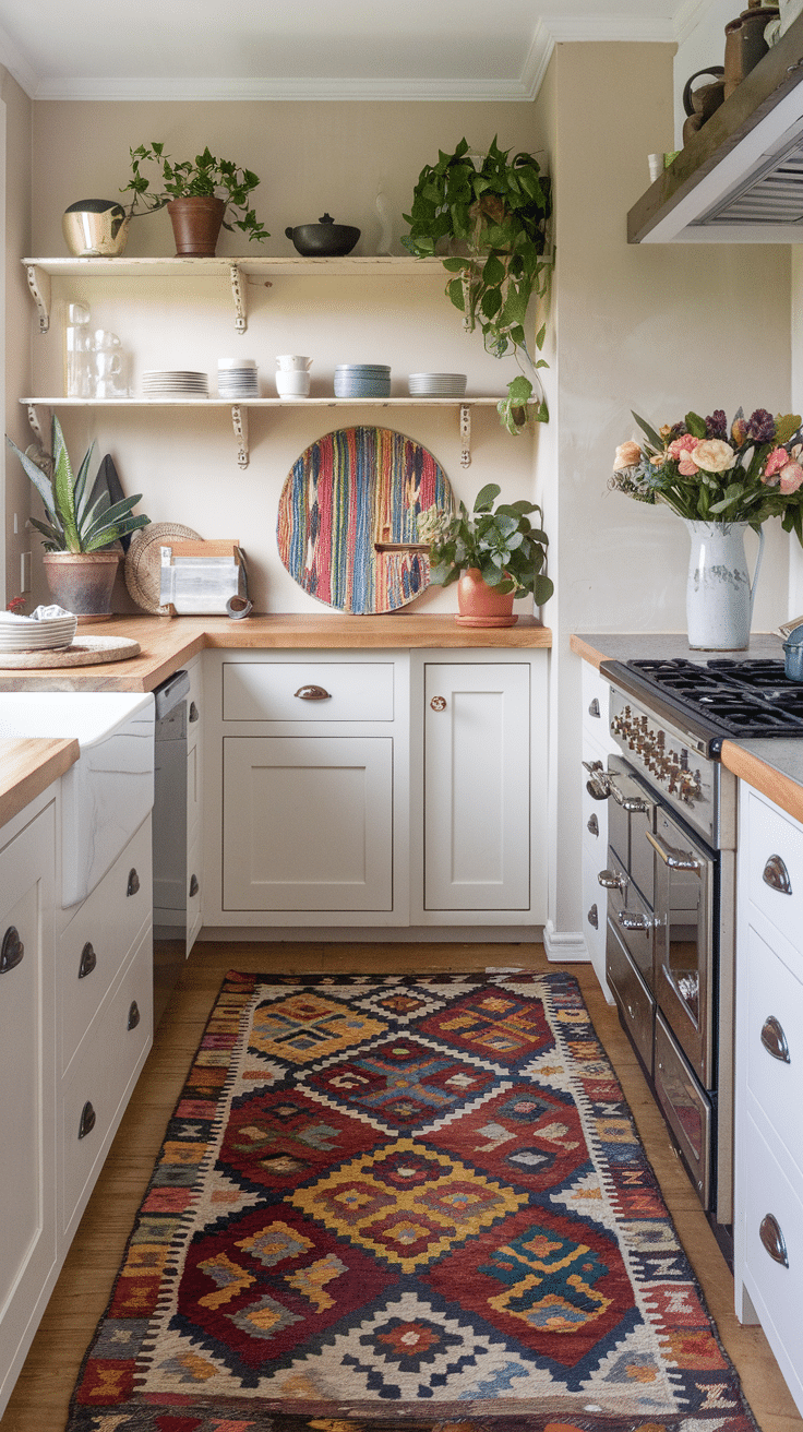
Start with an Earthy Boho Color Palette as your base:
- Warm browns (like your favorite wooden furniture)
- Soft orange-browns (like clay pots)
- Gentle greens (like garden plants)
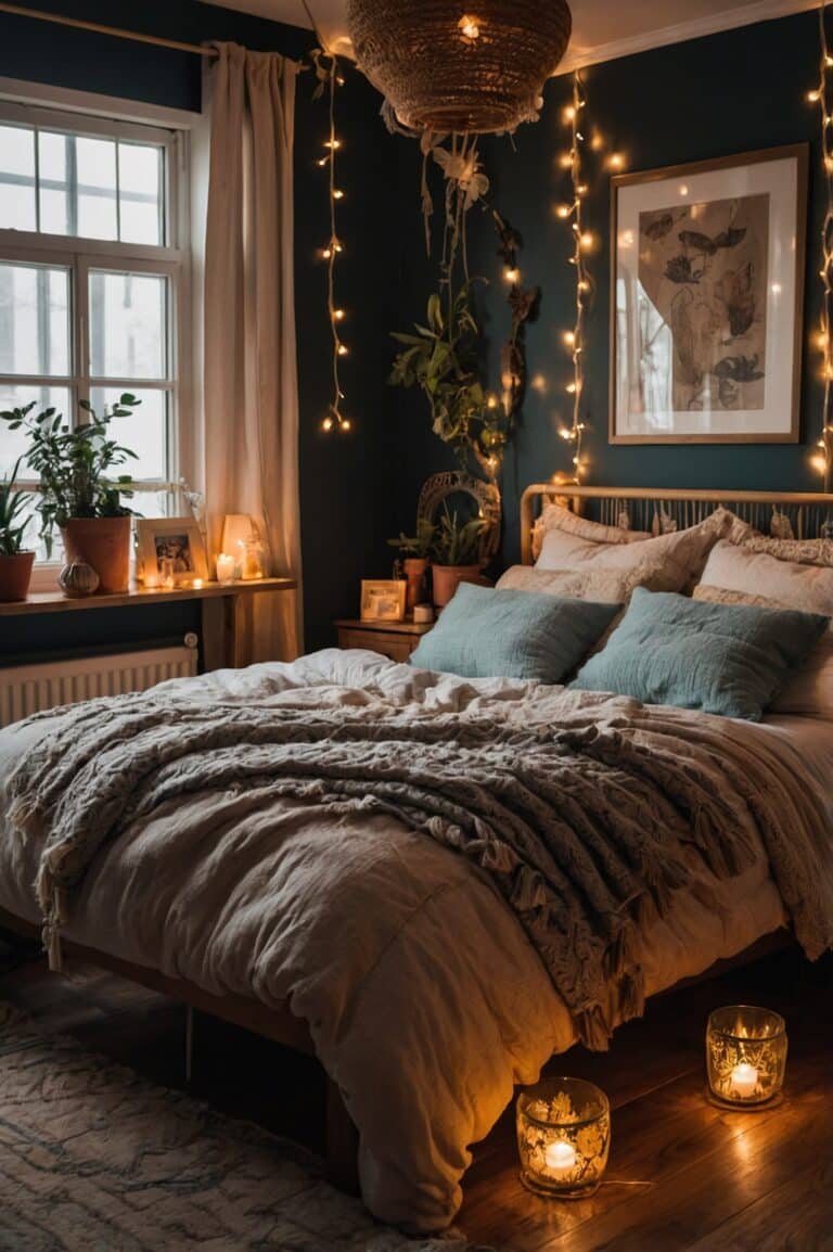
For the exciting part – try a Bright Boho Color Palette by adding:
- Orange and pink (like a beautiful sunset)
- Deep purple (like your favorite flowers)
- Blues and turquoise (like the ocean)
The best part of a Bohemian interior color palette is that there’s no wrong way to create it! You can:
- Create a Vintage Boho Color Palette with soft, sweet pastels.
- Choose a natural Global Color Palette with plenty of greens.
- Design an Eclectic Decor Color Palette with bright, happy colors.
If you love a color, use it!
Tip 1: Embracing Earthy Foundations
Ready to build your perfect Bohemian Color Scheme? Let’s start with some Boho Color Palette Inspiration straight from nature!
Close your eyes and imagine:
- Walking through a forest filled with rich greens and browns
- Or exploring a desert glowing with sandy golds and rusty reds
These natural places give us the best ideas for an Earthy Boho Color Palette.
Start by picking colors that remind you of your favorite outdoor places. That’s the first step to creating your own cozy boho space!

Choosing Your Base Colors
Start with earthy tones as your foundation. Consider rich browns, soft beiges, and muted greens. These natural colors foster a calming atmosphere – like a warm hug.
Mix different shades – nature doesn’t stick to one color, nor should you!
Incorporating Natural Pigments
Incorporate the beauty of natural pigments into your boho palette. Terracotta, ochre, olive green, and burnt sienna are essential.
These warm tones create a relaxing atmosphere in your cozy space. Don’t shy away from muted shades—they add depth and character.
Most homeowners start with neutral colors for a calming base. Trust your gut – if a color feels grounding, it’s right for your boho palette!
Tip 2: Adding Vibrant Accents
Ready to enhance your space? Let’s discuss how to add those striking pops of color that make boho style so enjoyable! I adore how lively accents can instantly transform a room from cozy to captivating.
Selecting Bold Complementary Colors
When choosing accent colors, think outside the box. Turquoise, fuchsia, and mustard yellow are all fantastic choices that complement earthy tones.
Did you know that warm colors like “peach pie” and cool tones like deep teal create a balanced, harmonious effect? These eclectic color combinations can increase engagement and visual appeal.

Balancing Bright Hues with Neutrals
Balance is the key to achieving the boho look. For more ideas on creating a peaceful home environment, explore our guide on how to embrace serenity with cozy home decor.
Pair bold accents with neutral tones to avoid overwhelming the space. For instance, terracotta accents look stunning against a soft beige or crisp white backdrop.
Consider limiting vibrant colors to 10-15% of your overall scheme. This maintains the focus on those beautiful earthy tones while adding a touch of boho flair.
Your home should reflect your personality. Don’t be afraid to mix and match colors until you find a combination that feels right for you.
Tip 3: Incorporating Patterns and Textures
Let’s explore the essence of bohemian style: patterns and textures. This is where your space truly comes alive.
Imagine wrapping yourself in a soft, chunky knit blanket. That’s the cozy vibe we’re aiming for here.
Mixing and Matching Boho Prints
Don’t hesitate to mix various patterns. A vintage color palette often features intricately designed rugs, playful prints on throw pillows, and subtle textures on curtains.
Consider combining a floral tapestry with a geometric rug. The key is to stick to your chosen color palette for cohesion.

Texture’s Role in Color Perception
Textures can change how we perceive colors.
A smooth, shiny surface might make a color appear brighter, while a rough, matte texture can soften it.
Experiment with various materials, like woven baskets, soft velvet, and textured linen. This generates a rich, layered appearance that encourages touch.
Tip 4: Harnessing the Power of Natural Light
Natural light makes spaces feel bigger and more welcoming. Sunlight can instantly brighten a room!
How Lighting Affects Color Perception
Light significantly affects our perception of colors. The same paint can appear different at various times of the day, and rooms filled with natural light may seem 20% larger.

Choosing Colors Based on Room Exposure
The direction of your windows affects your color choices.
North-facing rooms require warm, earthy tones toer light. South-facing rooms, benefiting from their warm light, offset the coolare ideal for bright colors.
I love using desert-inspired colors in sunny spots. They really shine!
Artificial lighting is essential for cozy nights. Mixing floor lamps, table lamps, and string lights creates a magical atmosphere.
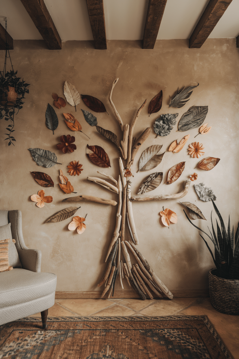
Tip 5: Bringing the Outdoors In
Bring nature’s beauty into your home! Lush greenery and natural textures instantly lift your mood and create a peaceful atmosphere.
Incorporating Plant-Inspired Colors
When picking your colors, be inspired by nature.
Think of the deep greens of forest ferns, the soft blues of a summer sky, or the warm browns of tree bark.
These colors evoke calmness and connect you to nature. To enrich your plant-inspired palette, incorporate rustic shades like terracotta or sandy beige.

Using Natural Materials to Enhance Your Palette
Add natural materials for texture and warmth. A jute rug, a wooden side table, or a woven rattan chair can complement your earthy tones. These elements create an organic, boho-chic vibe.
The beauty of boho style lies in its flexibility. Combine different textures, colors, and natural elements to create a unique space. Allow nature to inspire your interior design. Your home will appreciate it!
Tip 6: Creating Cohesion with Color Flow
Establishing a cohesive color flow is like creating a masterpiece. Each hue should blend seamlessly, leading the eye from one room to the next.
Establishing a Color Story Throughout Your Space
Select a primary color scheme, such as warm earth tones with jewel-toned accents. Apply these colors in larger areas—walls and major furniture pieces—and incorporate accent colors through smaller items.
This approach creates a harmonious flow that connects your entire home. Embrace eclectic color combinations! That’s the essence of boho style.
Using Color to Define Different Areas
Color can help define different areas within your home.
For instance, a vintage color scheme in your living room can inspire accents of the same shade in your kitchen. This continuity directs the eye and gives your space a more intentional feel.
In the boho world, rules are made to be broken! Enjoy experimenting with colors and observing how they transform your space.
Your home’s color palette should express your unique story. Trust your instincts and allow your personality to shine through your color choices!
Tip 7: Personalizing Your Palette
Your boho color palette should reflect your unique personality and experiences.
Incorporating Colors That Reflect Your Personality
Think about the colors that make you happy. Maybe it’s the deep blue of your favorite ocean or the soft pink of your grandmother’s rose garden.
These colors connect you to your space and make it feel real.
Don’t be afraid to use muted shades if you like a calmer look.
Telling Your Story Through Color Choices
Your home should tell your life story. Show off items that bring you joy, like a painting from your travels or quirky figurines.
These personal touches, along with your color choices, make your space truly yours.
To achieve a unique boho style, incorporate at least three cultural elements. Combine vintage finds with handmade pieces. This blend of old and new, along with your colors, creates a space that truly reflects who you are.
Embracing the Boho Color Journey
As we finish our colorful journey through boho, let’s pause and think about our path. The boho style, born from 19th-century art, has become a timeless way of expressing ourselves. It’s all about creativity and freedom.
The boho style is based on earthy tones. Start with warm, natural colors inspired by deserts. Then, incorporate bright hues like turquoise or emerald green to enliven your space.
Don’t hesitate to mix patterns and textures; it makes boho unique! To connect with nature, allow natural light in and incorporate plant-inspired materials.
Your boho journey is uniquely yours. You can just experiment with various color combinations that resonate with you.
The beauty of boho lies in its ability to adapt and evolve with you. So, feel free to color your world with the hues that bring you joy. Create a space that tells your story, filled with colors and items that resonate with what makes you feel at home.
The FAQ
Most Common Q’s
Other posts you might like: